OKCupid’s dating app for Android and iOS has its roots in older website-based dating platforms, and the clearest legacy of this is the sheer volume of profile detail it allows when signing up.
But with an influx of new, niche dating apps, is an industry giant like OKCupid doing enough to stay relevant? We’ve put together a full review so you can find out, without the heartache.
PLEASE NOTE: Dating apps are hugely subjective. Your ‘success’ and overall experience are likely to vary hugely from person-to-person. For our dating app reviews, we’ve tried to include as much objective information as possible, from reviewers who have used the Free and Premium features of each service. Where possible, we also include comments from the actual people reviewers meet via these apps, to try and get a balanced viewpoint from both sides.
OKCupid Overview
Key Features
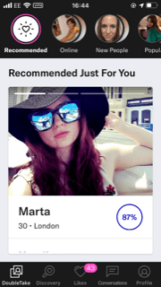
One of the more unique features of the app is its profile compatibility matching system, which, using a seemingly inexhaustible set of questions around values and beliefs (encompassing moral, lifestyle and political preferences), gives you a compatibility percentage score with everyone on the app.
For every lifestyle differential, the app gives you the option to specify whether something is a dealbreaker: for example, if you’re vegan, you can specify whether you need this attribute in a partner and how much it matters: not at all, a little, or a lot. These answers help inform the percentage algorithm. It’s hard to say to what extent this score influences people to swipe right, but kudos can be given for attempting to encourage less superficial behaviours.
There are literally thousands of questions you can choose to answer, to prompt users to give a complete picture of their character and personality.
One of the more novel features offered is the ability to send an intro message to any user, regardless of whether they ‘right swipe’ you. It’s perhaps a feature that gets a little lost though (I only received two intros among some 60 or so likes).
Design
Compared to most apps, OKCupid’s interface is rather busy and bewildering. Pictures are given priority in the feed, with the option to click through multiple photos by tapping the screen, while you scroll down to read profile blurbs.
The blurbs include a self-summary; including alcohol, drug and political leanings, whether you have kids or not and, somewhat controversially, ethnicity. This is balanced a little by a recent feature giving users the option to include a Black Lives Matter badge.

Along the top, there’s an options bar that lets you scroll in a variety of different ways. The default is OKCupid’s ‘Recommended Just for You’ but you can switch things up by searching instead by Most recently online, Just joined, Most popular (both of these options are for paying users only) or those who have answered lots of profile questions, for those who love the try-hard type (presumably).
You can also search using the Discovery tab which lets you search granularly by common interests or even by simply scrolling randomly through users’ Instagram feeds.
You’ll also get a daily email with a round-up of your top recommended profiles, giving you yet another way to view potential matches.
In summary, they seem to have discarded the whole ‘less is more’ maxim, which creates a fairly confusing online experience, especially for neophytes.
Profile options
You can upload up to 10 pictures and reorganizing them is easy enough. You can, in theory, connect your Instagram account, although this proved buggy in practice.
Fun ice breakers include things like your ‘Current Life Goal’, ‘Special Talents’, ‘TV Shows You Recently Binged Through’ and ‘Six Things I Could Never Do Without’.
Filtering
Filtering options are impressively advanced, even in the free version. As well as filtering by age and distance, you can also do so by body type, whether or not they want or have kids, height, religion, politics, diet, education, and even star sign.
Click on the ‘My Ideal Person’ tab to adjust your settings accordingly, and to narrow the crop of people in your feed.
Messaging

Messaging via the app is surprisingly limited, allowing only plain text. Even the pandemic has not prompted them to offer any video or image options.
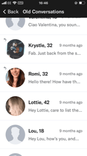
OKCupid seems livelier than most apps out there, with a vast pool of users to scroll through. The drawback to that is that matches often don’t reply or chat for very long, compared to others out there.
OKCupid Premium Pricing
OKCupid has a few different premium options available, focusing mostly on the A-List and A-List Premium options. The A-List lets you see who’s already liked you and send unlimited likes – it also removes all the ads.
A-List Premium goes a little further, offering those same benefits, plus one automatic boost per day during prime time, see everyone’s public answers to their questions before you answer and “see and be seen by more attractive matches”, though we’re not sure exactly how that translates in reality.
Profile boosts are sold separately, in packs starting from 10 up.
A list of all the paid features exists here.
A-List Basic
- $9.95 per month
- $7.95 per month (equivalent) for 3 months
- $4.95 per month (equivalent) for 6 months
A-List Premium
- $24.95 per month
- $22.95 per month (equivalent) for 3 months
- $19.95 per month (equivalent) for 6 months
Please note: Pricing on dating sites often varies according to many factors, and OKCupid has been known to vary it on an individual basis in the past.
Comments from a female dater
What did you like about OKCupid?
“The user base is huge. Even after you sift out the scammers, the profiles that just say “Ask me”, and the people you’ve got nothing in common with, you’re left with a lot of potentially eligible men.”What didn’t you like? What would you change?
“In an effort to Tinder-ize, the site has removed most of the truly useful features, like the ability to search for people in a particular area, or of a certain age. It makes a pretence of asking your ‘preferences’, then ignores them, and offers a selection of guys who are much older/younger/further away than you specified. It also experimented with hiding introductory messages sent by other users, but the huge negative reaction to that forced them to make intros visible again.”Have you ever paid to use it?
“No. Apparently, the only advantage is that you’re able to see who’s ‘liked’ your profile, which to my mind isn’t worth paying for.” [there’s a list of all the paid features linked in the Pricing section]“There’s a lively OK Cupid users’ forum on Reddit, and they make a point of telling new OKCupid members not to pay for the site. So, even if I’d been inclined to pay, the Reddit forum would have put me off.”
Related: Dating apps may all look the same, but there’s still a world of difference


Leave a Reply